Tuesday, April 11, 2017

The Last Step

Well, here it is my final post. I hope you have enjoyed this rollercoaster of a ride as much as I have. So, here is my Creative Critical Reflection...


Until, next time!!!

The Final Product

Well, here it is the final product. So drum roll please… I present to you #MUSE


Sunday, April 9, 2017

Final Details

I hate working with little kids!!!!! So, yesterday I had my photoshoot with all my interviewers (I know, I know I’m a bit late but unfortunately for me yesterday was the one and the only day they were available). And I interviewed a girl who is four years old, so she was supposed to get to my house at 1:00 but she fell asleep, so we thought we should wait until she wakes up because then she would wake up all crabby. Well, that didn’t work because she woke up at 3:00 and she was still crabby. I had to call her mom to come and help and luckily she came and that calmed her down a bit but I couldn’t turn on the light because that bothered, and she didn’t want to look at the camera, and she wouldn’t stay still so after an hour of trying (and crying) I took a picture that wasn’t that bad and could work so I decided to just use that one because otherwise, I would still be taking pictures today. Next, was the girl who is 16 years old (to get her was actually easy because all of mine and my sister’s friends are teens so I just used my sister’s best friend who practically lives here). She was easy peasy to take a picture of, compared to the four year old. The only issue with her is that the one time I needed her to stay she had to leave, and since I took so long with the four year old I had ten minutes to take her picture so I didn’t take the exact picture I wanted but I took a picture I was happy with. Luckily the adult I used was my mom so I was able to get the perfect picture I wanted. I then went on Pics Art and for the little girl picture I highered the brightness a little bit,highered the contrast, lowered the highlights, increased the saturation, and increased the shadows. For the picture of the teen, I higherd the highlights, increased the saturation, and lowered the contrast. As for the picture of the adult I was pretty happy with the picture so I didn’t want to damage it too much but, I did higher the saturation a little bit.
Yesterday night I also had a family party, and I as still missing a picture for my editor’s note, so I was looking for inspiration and then I got it, while my mom and her friends were clinging glasses. I got them together and took a picture of them clinking their glasses. I then went on PicsArt and took off the color of the picture for everything but the actually champagne in the glasses, so that the champagne can stand apart from the rest of the image. I then cut out the silhouette of the girls in all the pictures.
Today I put everything in their layout and made sure it was what I had imagined it to be, and I was pretty happy with the result. Something, I want to mention is that I did change a question in the interview of the child and the adult and teen interview. Something else I want to mention is how I wanted to include images of the girls when they were younger but unfortunately, I didn’t have any pictures of when my mom was younger so I thought it would be odd if I included pictures of all the girls younger except the adult. So I decided to just not to add pictures of when the girls were younger. Another thing I want to add is how I decided to have my two page spread to be in a more casual tone to make it seem as if the writer was having a friend to friend conversation with the audience.Well, I think that explains everything see you soon.
(P.S. Can you believe this project is almost done!)

Saturday, April 8, 2017

Table of Contents: Part 2

Well, hello again. So I decided that I will update you guys on the table of contents. So, as I mentioned in my previous post I was debating on whether or not I should do a two page spread for my table of contents. So, as I was looking at my ad and both of pages of my two page spread I wasn’t content with it specifically with my ad because my magazine is a higher end magazine with an artistic twist to it. So, my ad had to be something high end and I don’t think I was able to capture that so I decided I’d rather scrap it. Next is my two page spread so as I kept looking at it I realized that it looks kinda repetitive so I decided that I am just going to keep one of the pages. The next problem that I found was to decide which of the two pages I want to keep. But, I wasn’t 100% happy with either image so I went on PicsArt and took the original image I took off the shoe and highered the brightness a little bit to make it look cleaner. After that I decided to add an effect they had called Plein Air I then decided to take out the color and darkened the effect a little bit since the shoe is white, so it can be a noticed a bit more. By doing this I thought I was combing the two images by keeping the original colors but also adding some type of artistic effect. I also decided to change the font to a more straight and clean font that way it matches the font that I used on the cover. Since I decided to add three more cover lines so now there are seven stories on my table of contents. I also decided to keep the same color scheme by having the page to be white and the font to be black and the image I decided to add is also black and white correlating with the color scheme. Here is the image I decided to add to my table of contents:

{"source":"editor","contains_fte_sticker":true,"effects_tried":0,"photos_added":0,"origin":"gallery","total_effects_actions":0,"total_editor_time":539,"tools_used":{"tilt_shift":0,"resize":0,"adjust":0,"curves":0,"motion":0,"perspective":0,"clone":0,"crop":0,"enhance":0,"selection":0,"free_crop":1,"flip_rotate":0,"shape_crop":0,"stretch":0},"total_draw_actions":0,"total_editor_actions":{"border":0,"frame":0,"mask":0,"lensflare":0,"clipart":0,"text":0,"square_fit":0,"shape_mask":0,"callout":0},"brushes_used":0,"total_draw_time":0,"effects_applied":0,"uid":"042EEC82-F85A-4224-BD12-77259DFF7B6B_1491078404432","total_effects_time":0,"sources":["228771444061202"],"layers_used":0,"width":224,"height":618,"sticker_id":"C80F673E-B803-427E-8ED8-E15A327A2303","subsource":"done_button"}

Thursday, April 6, 2017

Major Update

I know, I know I haven’t blogged in forever. But this week has been hectic between this project and school I have fallen a bit behind. But, I’m back and we are on week four and the deadline is quickly approaching (as in this project is due in less than a week!!!), and there is still a lot to be done. Although this weekend I made a major dent into what had to be done. As in I have the cover, the table of contents and the editor’s page done. I have most of my two page spread down and the ad is still coming along. So, as you can see I was a busy bee this weekend. Anyways, I think I would use this blog post to explain how I got everything done. So, let's start with the cover on Saturday my friend came over and before I had boughten a white sheet and hang it up on a wall in my room because I get the most natural light. But, when she got to my house the day went from a sunny spring day to a spring storm day. So, I found this lightbulb I had in my garage which emulates natural light and I got my sister to carry a lamp near the camera and believe it or not it emulated natural light.  
FullSizeRender.jpg FullSizeRender.jpg
Unedited Edited
Above is a comparison of the unedited and the edited picture of my cover model. With my unedited picture, I was quite happy but I wanted to make my picture look a little more natural so I downloaded the app PicsArt and I increased my brightness, decreased my contrast, and highered my saturation. I did this to brighten the picture even more. Once, I was happy with the picture I downloaded the app Photo Lab and I used the effect Cubism Acrylics and on top of that, I layered the effect Crayon Strokes Abstract. I layered the second effect to make the lines less harsh, below is a picture without the layered effect and with the layered effect. Something else I want to mention is that with the original picture I decided to not edit out her loose hair and I didn’t have her apply any make-up to further show that this is a normal girl and that in a way she is breaking away from the usual expectations of how covers are perfect and blemish free. Once I had my two pictures edited exactly how I liked it I used the app Pic Collage to split their faces and combine them, to get my final result.
FullSizeRender.jpg FullSizeRender.jpg
      With one effect       With two effects
Once I had my cover image I went on Canva and they started looking through their magazine templates, and as I looking through them I knew that I needed a template where the picture wasn’t the whole cover because it would be too overbearing. And as I started looking I found a template that I liked but I didn’t know if it would have worked for my magazine so I started playing around with the tools and effects and I found my cover. So I decided to make the background white so that the cover image could stand out, to make it stand out even more though I decided to add a red effect to the picture it’s super subtle but it helps the image stand out from the white background. Then I decided to add a dateline but I had to move it a little bit to the right so that the color wouldn't blend in with the hair that much. In the bottom I added my title, and I decided to go with a straight, simple font. Underneath the title, I decided to add a selling line. This would be present in all issues of my magazine and it describes the three main topics of the magazine. And on the top, I decided to add the Q.V. Code because although the main way I would distribute my magazine is through subscription, you could also buy at certain bookstores. Overall, I decided to go the more artistic route, while still keeping it simple and modern.
Next, the table of contents so I originally thought of making it a two page table of contents and add an ad and an editor’s letter but my original plan for my table of contents was to have the text going around the shoe, the same shoe on both pages but on each page have the shoe facing a different way to make it look as if the shoes were walking but I came upon two problems one when I strived the add the text around out it looked too cluttered and messy and it didn't look good so I decided to trash that and then I was just going to still use the same shoe, making it look as if it was walking but the shoes would be on the side of the page. Well when I tried to move the picture to make it look as it were walking, the page looked awkward and it didn't look right so I trashed that idea too so now I was just going to have the same shoe for both pages on the same side and I liked it but my peers thought it looked repetitive so then I asked my friend and she gave me this idea of having one page making it look normal and add an effect similar to the one that I used in my cover on the other page to the shoe of the other page. I really like this idea, but I am considering to only have a one page table of contents and let the other page be an editor’s note, and just scrap the ad and the second page but I’m not sure.
As for, the editor’s letter I have it all written up but I’m still playing around with the format because I know I want to keep it very clean and simple, but I also know I don’t want it to look boring. So, I am testing out different templates on Canva.
Now, for my two page spread I really tried to focus as to why our style changes so much as we grow up, for the first page and the second page is just going to be the interviews with the girls of different ages. I plan on keeping the same theme of clean and modern, but I would also like to incorporate an artistic twist. This is where I am having problems because I don’t know exactly how I want to do it.

Well, I think that’s pretty much everything see you soon!!!!

Thursday, March 30, 2017

Short, Sweet, and Simple


As promised today’s post is going to be short. Yesterday, we had our second peer review. So I started explaining my project to my peers and they really liked my idea for my two-page spread. They also recommended that when I interview the people for my story, I include pictures of their style for when they were younger. I didn’t think I was allowed to do this because they wouldn’t be my original pictures. But, when I asked my teacher she said I could use them but I can’t include them as part of my five original pictures required. Something else I asked their advice on was what to make my cover image and one of my peers recommended I take a close up picture of a girl, and then have that picture be half a regular face and the other half be of graphic design like the one below (I know I already showed you this picture but I really liked the type of graphics they use here). I liked this idea because my cover story is about change and most of the stories on my table of contents are about change. So I think if I use this as my cover it would be a good representation of the contents of the magazine. After that, I should them what I have been doing for my table of contents and they liked it a lot. My peers, also really liked how I wanted to add an editor’s letter. Other than that they thought that I was on the right track.

Wednesday, March 29, 2017

All there is to know about the cover

As promised earlier this week this post is going to help explain the ideas going around my head as to what I want to do for my cover. So first is first, the title. As previously mentioned, I decided to call my magazine #MUSE (F.Y.I. I am not 100% sure if I want to use only caps lock but when I mention the title I will write it out in caps lock for consistency). I decided to go with this title because I thought it was the most original of all of the title options. But as I started to research what muse means, I was happily surprised to find out that one of its definitions is a goddess that inspires a creative artist. I liked this because I think many people usually don’t realize that fashion is a type of art, and one of the goals of this magazine is to explore this concept and break away from the stereotypes that people think of when someone mentions fashion. But muse, along with a majority of the other words in the English dictionary, have various meanings and one of the other meanings muse has is to gaze meditatively or wonderingly. And this is how I want my readers to be; I want them to question the world and make their own conclusions about things and not be restricted by stereotypes. But muse isn’t the only part of my title; I also used the hashtag and I wanted to use the hashtag to appeal to the younger audience reading the magazine. Although my target audience is 16-30 year-old women, I believe even the higher end of the spectrum can relate to the hashtag (I mean my mom is 47 and she looooves hashtags).
The next part that I want to explain of my cover is the color scheme. As I began to research color psychology and looking at all the colors, I realized that all the color palettes that I like where accented neutral color palettes (an accented neutral color palette is to use neutral colors such as black, white, and grey and then add a pop of color such as red, purple, blue). And then it hit me I want every issue of my magazine to have an accented neutral color scheme but each issue would have a different accent color. But for the one I am creating here I don’t know the exact color I want to but here are some of the colors I am leaning towards:

As you can see I’m looking for colors that are very bright, and vibrant to help them pop. I also chose these colors because this magazine would be the April issue which is at the beginning of spring and spring is known for its bright colors.
Next, I want to talk about the font I want to use. So I know want my font to be very simple and clean because my plan for the cover image is to add graphics. I don’t want an elaborate font because I don’t want a cluttered cover. I’m unsure if I want it to be very straight and symmetrical or if I want it to be curved but still simple and classy. I think the way I’ll decide what font I want to use depends if I make my title in all caps or all lower case letters. I believe that if it’s in all caps, I would prefer a straight symmetrical font, yet if I choose lower case then I want a more curved font.
Now the biggest part of the cover, the cover image. Once I finally decided what I wanted my two page spread to be I knew that I didn’t want that to be on my cover. So, I’m kinda stuck on what exactly I want my image to be. All I know is that I do want to combine graphics somewhere with the image.
And lastly, the cover lines. So, what I decided is that I don’t want to add any extra cover lines. The only cover line I would add would be of my cover story but I am still debating this since my two-page spread isn't the cover image. Although I might add one because most magazines have at least one cover line corresponding to the cover image. Anyways that pretty much explains my cover,  until next time
(P.S. sorry for the two long posts in a row I’ll try for the next one to be shorter)

Tuesday, March 28, 2017

The fog is starting to clear up

Well, we’re in week three of this project (holy shit!!!!!). I know I wish I could stop time too but sadly we can not. So how about I gave you an overview of how my day went yesterday so you can understand how I am currently feeling. Let’s start at the very beginning, I woke up at 6:00 a.m, like any regular weekday, if only I knew the set of cards the universe had in store for me that day I would have easily stayed sleeping. Anyways I got to school and went to my first hour, I have study hall so I decided to work on this project and I thought everything was running smoothly. I was testing different programs, such as Canva and Joomag, primarily for my table of contents, trying to get a feel for how I wanted to approach everything. I was actually quite proud of myself because I thought I was ahead of the game (keep in mind I was oblivious to the fact that we only had two more weeks for this project, I could have sworn we had three more weeks). Anyways, during my second hour, my teacher starts handing out a test on Catch-22. To say the test was brutal is an understatement, so that instantly changed my mood. So now we're in third hour suddenly not feeling very content with myself, we start working on our projects; and I was pleased because I really enjoy doing this project; it kinda feels like a stress ball, except for yesterday. Yesterday, it was quite the opposite, because I started asking my peers what they have done and all them seemed far more advanced than me, or they at least had a game plan. I felt like I had nothing done as if I suddenly had the weight of the world on my shoulders. But, my day doesn’t end there. No, the universe really hated me yesterday because from there I went to APUSH to take another test (hip-hip-hooray). So, I finished the test in 40-45 minutes and the rest of the period we were supposed to work on a worksheet we had to print out... well, I might have forgotten to. So, instead, I decided to take out my computer and to continue working on my project. Except, I don’t know why but yesterday as I was looking at my computer screen and seeing everything I wanted to accomplish by the end of this week, I became anxious. So I closed it down and went with the classic pen and paper routine. And I told myself OK there’s no more time to waste, it’s time for me to put my big girl pants on and finally, start making choices (because completing this project I noticed that I am a bit indecisive). So, below is a bit of my planning that I made yesterday:

So the outline above may be a little messy so here’s a breakdown for you:
  • Well first is first I have finally picked my title!!!! (Drum roll please) And the title is …… #MUSE
  • The next part is titles for stories that I want to add to my table of contents. I did this mostly just for clarity
  • Below that, I have a section where I write what could be my story. Well, cross that I have already changed my story (I know, I know I’m very indecisive). So anyways, my new story is how we change our fashion taste as we grew up. So, my plan for this is to have one page explaining why and how our styles change. The following page I want to include two to four interviews with people of various ages.
  • I also wrote a section of what I want to do for my cover page. Here I included a possible layout and other ideas I am tossing around in my head (later this week I hope to write a post solely on my cover page where I want to include the type of font I want to use, the color scheme, etc.)
  • Below that, I wrote about how I want to include an editor’s note and the message I want to let across with this note.
  • Next, to this, I wrote about the possible ad I want to include. I wrote that I might want my ad to be of canvas bags because I see them making a comeback, but I’m not sure yet if I want this to be my ad (I know my indecisiveness is a real issue).

Anyways, after I wrote this down I felt like a relief come over me because I might not be as advanced as my classmates I at least have a plan (I’m the girl with a plan :)).

Sunday, March 26, 2017

Layout Research

Well, the end is nearing and I am pretty sure I know what I want to write about as my cover story so now I have to work on my table of contents and my cover. So since I wanted to include different graphic designs with my cover image so I decided to look up different tutorials on how to create graphic designs. I found two really good tutorials to teach me on how to create graphics. But I also have a friend who takes classes on graphic designs so I want to ask her for help and advice.


I also have been thinking and research at different fashion magazines to decide how I want to create my table of contents and I decided that most fashion magazines use the first page for an ad, the second page is the first page of the table of contents than the back is the second page of the table of contents and the next page is something like an editor’s note or an editor’s monthly picks and than the two page spread. I like this format but I’m not 100% sure what I want to do for the editor page. I want my table of contents to be very simple and minimalists. I don’t want to include many pictures I think that if I do I would want to include at most three pictures but I am leaning more toward one picture. If I include a picture I would want it to be in the middle and have the text of the table contents surrounding it. Here are some examples:


Double Exposure Effect Photoshop Tutorial. (2015, May 26). Retrieved March 26, 2017, from https://www.youtube.com/watch?v=Mbf-QXCCXgM
B. (n.d.). Editorial | Harper's Bazaar Magazine. Retrieved March 26, 2017, from https://www.behance.net/gallery/32516619/Editorial-Harpers-Bazaar-Magazine
Graphic design tutorial for beginners | How to learn Graphic design. (2015, September 09). Retrieved March 26, 2017, from https://www.youtube.com/watch?v=bGJX9qT9hmk
Harper's Bazaar. (n.d.). Retrieved March 26, 2017, from http://kellymillington.com/harpers-bazaar/pq9c7nhqvs5kg5vj3wnk4qvftdqs98


Saturday, March 25, 2017

Enlightened

I have never felt more inspired before!!!!! To fully understand why I feel like I have been rebirthed. We have to start from the beginning. So, remember earlier this week I wrote about how my peers were trying to give me ideas for my cover story. Well, I decided I was going to research some more and in the midst of all my research, it hit me. When I first embarked on this journey I knew that I wanted my two page spread to be something meaningful, I wanted to write about how fashion influences society. Because many times I think fashion is undervalued, and many people don’t realize the hold it has on us. So, I decided to go to Google and type in the search engine box how fashion influences society and a series of articles appeared and I felt inspired. Specifically with this one article that talked about trends and how trends influence us. I also found four other articles that relate to one another that I want to use as inspiration for my article. The only roadblock that I see if I decided to write this article is how and what pictures to include that would go with the article.


Cultural Influences On Trend Forecasting. (n.d.). Retrieved March 25, 2017, from http://www.intothefashion.com/2010/01/cultural-influences-on-trend.html
Fashion Trends' Impact on Society. (n.d.). Retrieved March 25, 2017, from https://www.notjustalabel.com/editorial/fashion-trends%E2%80%99-impact-society
Gibbs, S. (2013, September 13). Editd aims to spot the trends the fashion world doesn't. Retrieved March 25, 2017, from https://www.theguardian.com/technology/2013/sep/13/editd-fashion-trends-big-data
Influence in Fashion. (2014, March). Retrieved March 25, 2017, from https://www.1843magazine.com/content/lifestyle/rebecca-willis/influence-fashion

Lalovic, I. (2013, December 04). Fashion Designer's impact on Modern Society. Retrieved March 25, 2017, from http://wsimag.com/fashion/6387-fashion-designers-impact-on-modern-society

Tuesday, March 21, 2017

Ideas are flowing

We are on week two of my portfolio project; I know time is flying by. Anyways, remember last week when I wrote about how I had no idea what I was going to write about in my two page spread. Well, yesterday my teacher split my class into four groups and my peers and I started presenting our projects to each other and we asked each other for advice on any conflicts we might have. So I explained the concept for my magazine and I asked them if they had any ideas for the two page spread. Luckily, they all were able to help me out and here are some of the ideas they have come up with:
  • Explain how fashion trends are always making comebacks.
  • Show how we dress can influence how we act.
I thought that these two ideas were different and unique stories I could write for my cover story. But for me to truly to stick to an idea I want to further my research and ensure I write the best story I can. So, keep tuned so I can finally tell you guys what story i decided to write about.

Friday, March 17, 2017

Perplexed is an Understatement

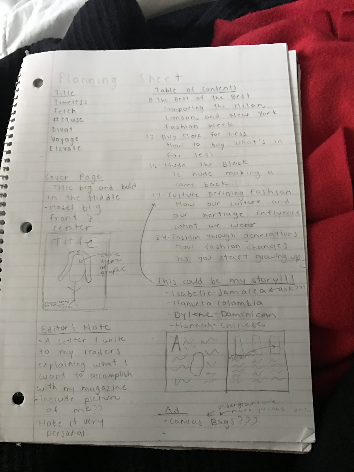
Hello, my fellow readers. So I have come across a road block. I have absolutely NO IDEA what I’m going to do as my two page spread!!!!!! All I do is try to come up with possible stories but I can’t think of anything, so seeing that I can’t come up with anything I have been asking everyone to see if someone can help me. But nothing zip, zero. So I decided that I was going to look into different magazines to see if a lightbulb turns on.
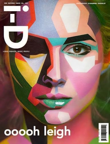
One article that I found was from i-D magazine where they talk about a documentary of a certain designer. This is becoming more and more popular, although not many people know about them. So, I thought a possible two page spread could be to research into them and explain them and bring awareness to them.
Another article I saw that sparked my attention was one called five fashion films that broke the mold. This differs from the documentary movies because it talks about how the costuming of the actors had influenced the fashion world.
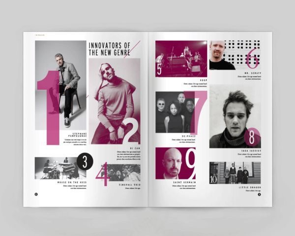
A trend I saw is how fashion is being incorporated into the technological world. For example, there was an article of how Chanel came out with emojis, similarly to how Karl Lagerfeld; a designer for his own brand, Chanel, and Fendi; came out with emojis. There was also another article on V magazine that talks about how Gucci is incorporating memes into their marketing campaign. This shows how the fashion industry is embracing how technological this generation has become. Here are some examples of the memes Gucci used:


Overall, I found that many of the articles are very opinionated. I think this cleared some things up for me; although I’m still not quite sure what I am going to write about in my two page spread. Hopefully, I’ll be able to share with you guys what I finally decided to write about soon. Well, until next time!

At last, we have chanel emojis | read. (2017, March 09). Retrieved March 17, 2017, from http://i-d.vice.com/en_us/article/at-last-we-have-chanel-emojis
Defebaugh, W. (2017, March 17). Gucci Created a Series of Memes for Its New Collection of Watches. Retrieved March 17, 2017, from http://vmagazine.com/article/gucci-created-series-fashion-memes-new-collection-watches/
Fashion. (n.d.). Retrieved March 17, 2017, from http://i-d.vice.com/en_us/topic/fashion/page/1
Filter. (2015, May 27). Retrieved March 17, 2017, from http://vmagazine.com/filters/fashion/
Five fashion films that broke the mold | read. (2017, March 07). Retrieved March 17, 2017, from http://i-d.vice.com/en_us/article/five-fashion-films-that-broke-the-mold
Watch joe mckenna's beautiful film about fashion master azzedine alaïa | read. (2017, March 14). Retrieved March 17, 2017, from http://i-d.vice.com/en_us/article/watch-joe-mckennas-beautiful-film-about-fashion-master-azzedine-alaa

Thursday, March 16, 2017

Progress

Today I decided I was going to tackle a component of my portfolio project that I still haven’t talked about, and that is the table of contents. So I looked up tips to create my table of contents and I came upon an article where they listed the top 50 tips to complete a table of contents. Here are some of my favorites:

1. To use a gradient
2.Combine type and photography
3.Use a bold typeface
4.Play with alignment
5.Foreshadow content

 I think that I can make some sort of combination of these tips and make my dream table of contents. As I researched different fashion magazines I noticed that most of them have a one page table of contents, and on the next page it’s usually an editor’s note. I also learned that the first two pages of magazines are typically ads, and the next page or two is the table of contents. This means that other than the cover page, this your first impression to your readers. So your cover page should establish the tone and mood you want to create with your magazine. 

 I also know that with my table of contents I would like to include some images but I don’t want all pages to have an image to not overcrowd the page. I would only include images on the important stories. If I don’t include images than I would change the font sizes to show how some stories are more important than others. 

 Here are some examples I want to use as inspiration:


Brochures : in Editorial Design. (n.d.). Retrieved March 16, 2017, from http://designspiration.net/image/1517003423784/
Designing the Perfect Table of Contents: 50 Examples to Show You How. (2016, January 06). Retrieved March 16, 2017, from https://designschool.canva.com/blog/table-of-contents-design/
Friedman, V. (2017, March 15). Table of Contents: Creative Examples – Smashing Magazine. Retrieved March 16, 2017, from https://www.smashingmagazine.com/2008/07/table-of-contents-creative-and-beautiful-examples/
B. (n.d.). Reanimate Film Magazine. Retrieved March 16, 2017, from https://www.behance.net/gallery/3899913/Reanimate-Film-Magazine
Table of Contents Design: 30 Excellent Examples from Around the Web. (2017, January 27). Retrieved March 16, 2017, from http://allfreedesigns.com/table-of-contents-design-examples/
Yum. Gluten Free Magazine March 2015. (n.d.). Retrieved March 16, 2017, from https://issuu.com/yum.glutenfreemagazine/docs/ygf_mar__14/5

Tuesday, March 14, 2017

HELP!!!

Can you believe that it has been a week since I started this project, I know time is flying(ahh)!!!! So, last night I was trying to figure out what was my next step, and I realized that part of the reason why I feel so lost is that I haven’t gone into depth in my research for my genre. So, as a way to clarify my thoughts I researched, researched, and researched some more. Part of my research was to figure out fashion magazine’s target audience and I found that most magazines have a target audience of 20-40 year old women, but I also found that some magazines are trying to lower their target audience because research has shown that younger people are more likely to buy a magazine than the older generation. I also found that many high end magazines would have their target audience be higher income people, but again this is something many fashion magazines are trying to change. They are realizing that there is a higher market if they lower their target audience to middle class, this allows them to increase their market.  After this research I decided that the best target audience for my magazine would be 16-30 year old women, primarily middle class. I think I can use this research as a guide for my magazine, specifically for my two page spread.


Voltolina, V. (2009, January 20). Fashion Magazines' New Target Audience: 'Recessionistas' Retrieved March 14, 2017, from http://www.foliomag.com/fashion-magazines-new-target-audience-recessionistas/
Vogue, Tatler and other high-end women's magazines target teen market. (2013, August 30). Retrieved March 07, 2017, from https://www.theguardian.com/media/2013/aug/30/womens-magazines-teen-market

Sunday, March 12, 2017

And the decision is...

GUESS WHAT, GUESS WHAT, GUESS WHAT!!! I have finally chosen what genre I want to do for my magazine. Yes I know it was about time. Anyways the genre I choose is…… FASHION! After so much research, I realized is I just had to go with what my gut was telling me to do and that was to choose fashion as my genre so I decided to finally pull the trigger and make it official. So now what? More research, I know the research is never ending but have no fear this time the research is different. This time I decided that I had to research how to make a magazine. So that’s exactly what I did. Here are some tutorials I found of different softwares I can use when designing my magazine. Attached are two of the most useful videos I found. I also noticed that the two main softwares used when designing a magazine are Photoshop and Adobe InDesign. They each have their pros and cons but I believe that Adobe InDesign is the software that better fits my needs. Well, I guess it's time for me to get back to my research until next time.


P. (2014, July 17). How to Create a Stunning Magazine Cover in Photoshop. Retrieved March 12, 2017, from https://www.youtube.com/watch?v=3aAP1-hoEHk
S. (2015, June 15). How to Design a Magazine in Indesign CC Tutorial. Retrieved March 12, 2017, from https://www.youtube.com/watch?v=qF8DjE0KlPk

Friday, March 10, 2017

Decisions, Decisions

Today is day three and I still don’t know what genre I want to do (the anxiety levels are high). The one conclusion I did make is that I don’t want to do an interior design magazine; I want to do either a fashion or a cooking magazine. As a method to finally decide what magazine I want to do. I have indulged myself endlessly in research, luckily the research has become more like a hobby than actually work. Anyways, some of the conclusions I have made based on my research is that I want to incorporate graphic designs into my cover, possible with the mast head or the cover image depending on the genre I end up choosing. In the fashion magazines, I have researched I noticed they are incorporating graphics mainly through the cover image. In cooking magazines, it’s seen the least but when they are used they are primarily used with the masthead or the cover lines. Here are some examples of how magazine covers are incorporating graphic designs:


I decided the best way for me to finally chose my genre is to look up a magazine brand in each of my genres and truly analyze it. So, for my cooking magazine, I decided that magazine brand that best captures the essence and the mood that I want to create is Crumbs. When researching this magazine I learned they are a magazine that focuses on local cuisine. It recommends local restaurants, food markets, chefs, etc. They have various magazines that each focus on the cuisine of a different area. This is a characteristic I would like to explore if I do the cooking magazine because I believe it's a new and unique take on cooking magazines. I also learned that  Crumbs is a free magazine which can be found in local restaurants and food markets. Additionally,  Crumbs usually uses one food item as their cover image, instead of an actual plate. They do this because the rest of the issue typically focuses on this food item whether it be where are the best places to buy it, or the best recipes incorporating this food. The cover also uses unique fonts and changes fonts within different issues. In general, Crumbs tries to break away from conventional culinary magazines.


The magazine I decided to research and analyze for the fashion genre is i-D magazine. This magazine is focused on fashion overall but primarily focuses on how fashion affects our culture. This is something I might want to explore if I do a magazine within the fashion genre because I have noticed that fashion whether we like it or not is constantly affecting us and how we live. They also mention how every issue of their magazine has a wink, in a way, this is there selling line. This is another characteristic I would like to explore, even if I don’t do a fashion magazine. The cover of their magazines all have models, as their cover image but their images aren’t the typical cover images they all have a unique take on them whether they be in odd poses or they incorporate graphics to help make their images stand out. They have few cover lines, typically they only one which corresponds to the cover image. Overall i-D magazine tries to break conventional fashion magazine stereotypes.


Overall I believe that no matter what genre I choose I can use the analysis I have gathered from these magazines, in my own magazine. Well, I guess it’s back to research for me and hopefully tomorrow I will be able to tell you what I finally choose as my genre.

About. (n.d.). Retrieved March 10, 2017, from http://i-d.vice.com/en_us/about
About Crumbs Magazine: food and drink in Bristol, Bath and the South West. (n.d.). Retrieved March 10, 2017, from https://www.crumbsmag.com/pages/about-crumbs/
BBC - Press Office - BBC Magazines to launch Easy Food. (n.d.). Retrieved March 10, 2017, from http://www.bbc.co.uk/pressoffice/bbcworldwide/worldwidestories/pressreleases/2004/04_april/easy_food.shtml
Fashion. (n.d.). Retrieved March 10, 2017, from http://i-d.vice.com/en_us/topic/fashion
Food Magazine Target Audience. (2013, September 26). Retrieved March 10, 2017, from https://li9275.wordpress.com/research/food-magazine-target-audience/
Stockists. (n.d.). Retrieved March 10, 2017, from https://www.crumbsmag.com/pages/stockists

Tuesday, March 7, 2017

The First Step

Today, March 7, I officially start my portfolio project. To say I’m a nervous wreck is an understatement but I’m also quite excited. I believe that this project can be the start of something great, at least I hope so. A couple months back we had to pick if we wanted to do a film opening or a magazine issue; I knew straight away that I was going to choose the magazine issue because I love fashion and design and I think that with the magazine it will help me explore my passion. But, now comes the difficult part: choosing the genre (Breathe in, Breathe out). So, when I chose to do the magazine I was 100% certain I wanted to do a Fashion magazine. But now as I am doing research and looking at other examples I realize the choice isn’t so black and white; it’s actually quite gray. I’ve realized that I might want to do one of three options: a cooking magazine, an interior design magazine, or a fashion magazine. I have been using Pinterest as a way to gather inspiration and better explore the endless options I have in front of me but after looking at thousands of pictures I think these are the four main pictures that I want to use as my inspiration.


The four pictures that I chose each represent one of the three genres that I might want to do. They also capture the type of mood I want to create which is edgy and artsy, but also modern and contemporary. As I dive deeper into my research hopefully this choice becomes more black and white and less gray.


Fonts, Logos & Icons from GraphicRiver. (n.d.). Retrieved March 10, 2017, from https://graphicriver.net/
Galleries - Interview Magazine. (n.d.). Retrieved March 10, 2017, from http://www.interviewmagazine.com/galleries/
Modeillustrationen, Mode Collagen, Mode Skizzen. (n.d.). Retrieved March 10, 2017, from https://hermineonwalk.de/
Prosto Magazine. (n.d.). Retrieved March 10, 2017, from https://issuu.com/prostovkusno