I know, I know I haven’t blogged in forever. But this week has been hectic between this project and school I have fallen a bit behind. But, I’m back and we are on week four and the deadline is quickly approaching (as in this project is due in less than a week!!!), and there is still a lot to be done. Although this weekend I made a major dent into what had to be done. As in I have the cover, the table of contents and the editor’s page done. I have most of my two page spread down and the ad is still coming along. So, as you can see I was a busy bee this weekend. Anyways, I think I would use this blog post to explain how I got everything done. So, let's start with the cover on Saturday my friend came over and before I had boughten a white sheet and hang it up on a wall in my room because I get the most natural light. But, when she got to my house the day went from a sunny spring day to a spring storm day. So, I found this lightbulb I had in my garage which emulates natural light and I got my sister to carry a lamp near the camera and believe it or not it emulated natural light.

Unedited Edited
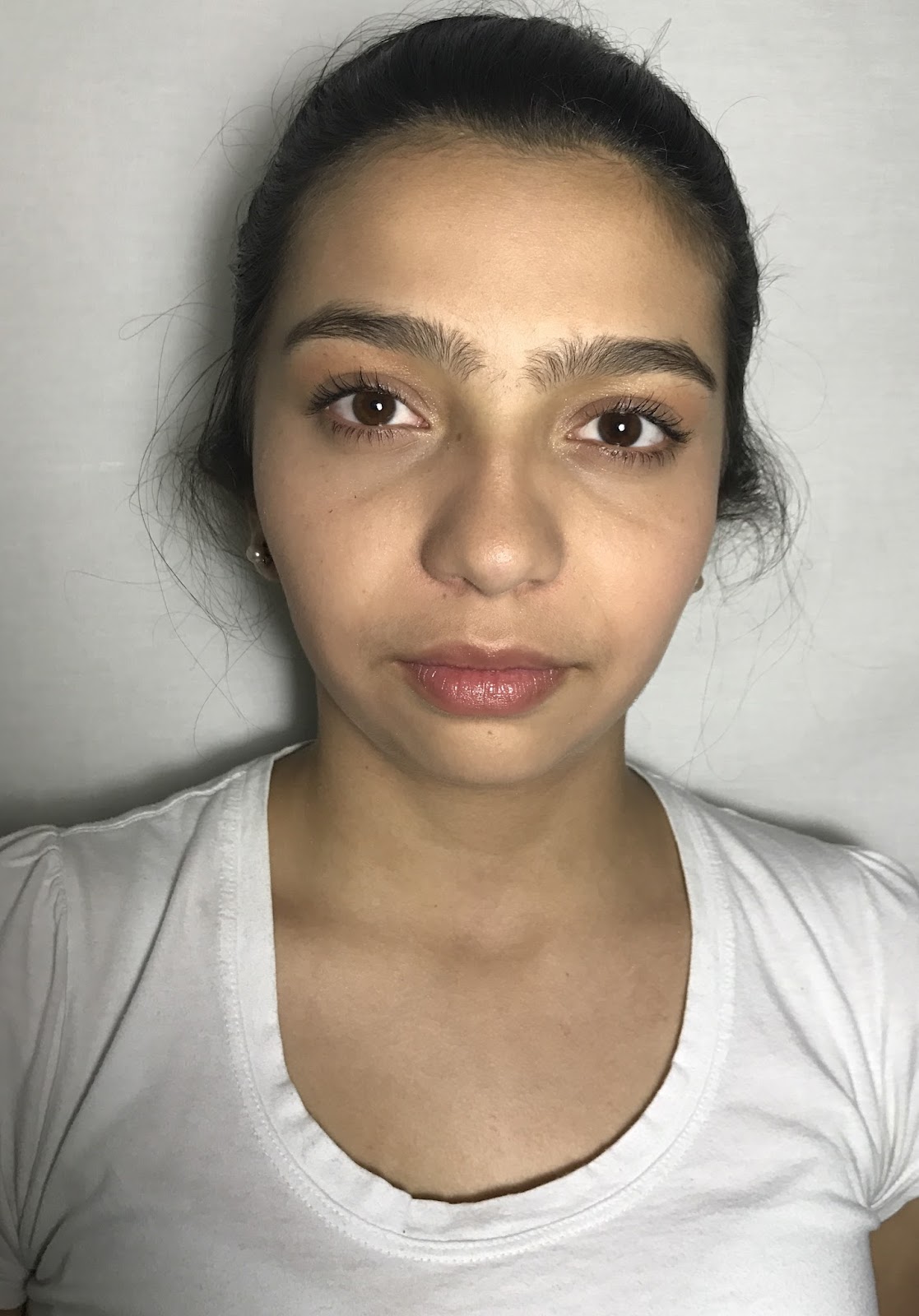
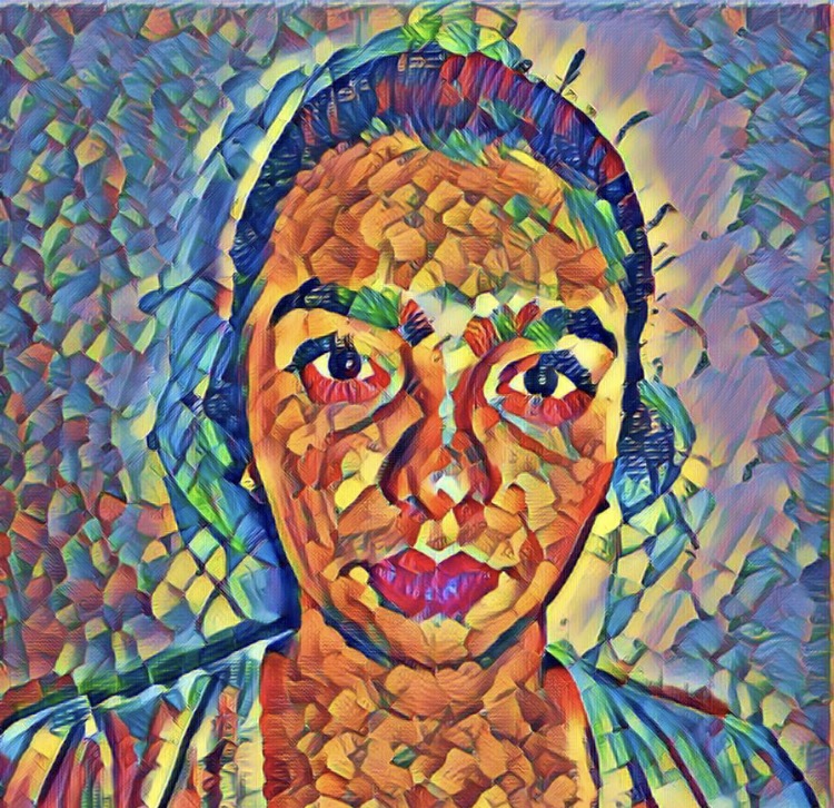
Above is a comparison of the unedited and the edited picture of my cover model. With my unedited picture, I was quite happy but I wanted to make my picture look a little more natural so I downloaded the app PicsArt and I increased my brightness, decreased my contrast, and highered my saturation. I did this to brighten the picture even more. Once, I was happy with the picture I downloaded the app Photo Lab and I used the effect Cubism Acrylics and on top of that, I layered the effect Crayon Strokes Abstract. I layered the second effect to make the lines less harsh, below is a picture without the layered effect and with the layered effect. Something else I want to mention is that with the original picture I decided to not edit out her loose hair and I didn’t have her apply any make-up to further show that this is a normal girl and that in a way she is breaking away from the usual expectations of how covers are perfect and blemish free. Once I had my two pictures edited exactly how I liked it I used the app Pic Collage to split their faces and combine them, to get my final result.

With one effect With two effects
Once I had my cover image I went on Canva and they started looking through their magazine templates, and as I looking through them I knew that I needed a template where the picture wasn’t the whole cover because it would be too overbearing. And as I started looking I found a template that I liked but I didn’t know if it would have worked for my magazine so I started playing around with the tools and effects and I found my cover. So I decided to make the background white so that the cover image could stand out, to make it stand out even more though I decided to add a red effect to the picture it’s super subtle but it helps the image stand out from the white background. Then I decided to add a dateline but I had to move it a little bit to the right so that the color wouldn't blend in with the hair that much. In the bottom I added my title, and I decided to go with a straight, simple font. Underneath the title, I decided to add a selling line. This would be present in all issues of my magazine and it describes the three main topics of the magazine. And on the top, I decided to add the Q.V. Code because although the main way I would distribute my magazine is through subscription, you could also buy at certain bookstores. Overall, I decided to go the more artistic route, while still keeping it simple and modern.
Next, the table of contents so I originally thought of making it a two page table of contents and add an ad and an editor’s letter but my original plan for my table of contents was to have the text going around the shoe, the same shoe on both pages but on each page have the shoe facing a different way to make it look as if the shoes were walking but I came upon two problems one when I strived the add the text around out it looked too cluttered and messy and it didn't look good so I decided to trash that and then I was just going to still use the same shoe, making it look as if it was walking but the shoes would be on the side of the page. Well when I tried to move the picture to make it look as it were walking, the page looked awkward and it didn't look right so I trashed that idea too so now I was just going to have the same shoe for both pages on the same side and I liked it but my peers thought it looked repetitive so then I asked my friend and she gave me this idea of having one page making it look normal and add an effect similar to the one that I used in my cover on the other page to the shoe of the other page. I really like this idea, but I am considering to only have a one page table of contents and let the other page be an editor’s note, and just scrap the ad and the second page but I’m not sure.
As for, the editor’s letter I have it all written up but I’m still playing around with the format because I know I want to keep it very clean and simple, but I also know I don’t want it to look boring. So, I am testing out different templates on Canva.
Now, for my two page spread I really tried to focus as to why our style changes so much as we grow up, for the first page and the second page is just going to be the interviews with the girls of different ages. I plan on keeping the same theme of clean and modern, but I would also like to incorporate an artistic twist. This is where I am having problems because I don’t know exactly how I want to do it.
Well, I think that’s pretty much everything see you soon!!!!
No comments:
Post a Comment